

Reforge Rebrand, 2025 & 2026
Leading the brand through two business shifts
The details
- Role
- Hands-on in-house brand and creative lead; responsibility description, rather than a claim to a formal title.
- Period
- Brand stewardship from 2023; principal changes in late 2025 and Q2 2026.
- Partners
- Marketing, product, sales, executive leadership, and an external identity agency.
- Scope
- Web experience, identity applications, motion, marketing creative, and sales materials.
Throughout 2025, Reforge expanded from professional education into AI tools for product teams. In 2026, Reforge returned to education after its acquisition by Miro. I led the in-house creative work across both changes. I translated an external agency’s identity foundations into a working brand, simplified how we presented four products, and adapted the system again for AI-focused learning.
On a three-person marketing team, I combined creative direction with hands-on web, motion, copy, and campaign production. My contribution was making the brand work across the places customers encountered it, while keeping each product’s value clear as the business changed.
Turning foundations into a usable brand
An external agency supplied the 2025 identity foundations: an updated wordmark, typography, color palette, and a single design accent pattern. I helped direct that work, then defined how it would behave in actual usage.
My implementation included substantial adjustments to product logo iconography, refinements to the color palette, and experiments with how design patterns could establish focus and personality. I developed additional patterns and their uses across web, slides, email, social, and in-product marketing. I also defined motion principles and produced the brand’s first animation and video work.
These decisions refined the foundational identity and gave it a broader expressive range, making it more applicable across the work our small team shipped on a daily basis.
When it came to messaging with the new brand, I advocated for simpler comms. I made my case by presenting tangible, divergent alts: marketing assets, prototypes, and examples that leadership, product, and sales could compare.
Leadership stayed close to execution and we interfaced weekly. I designed landing pages, wrote and designed marketing emails, edited blog copy, produced sales decks, and produced marketing videos end-to-end.
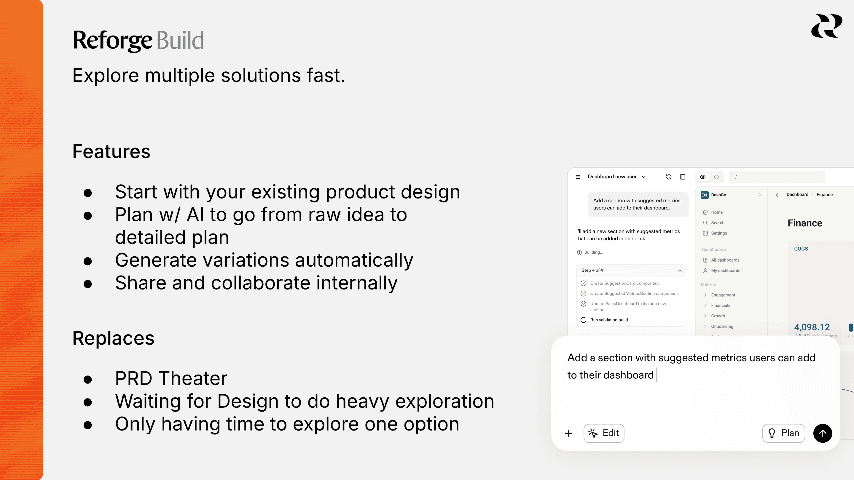
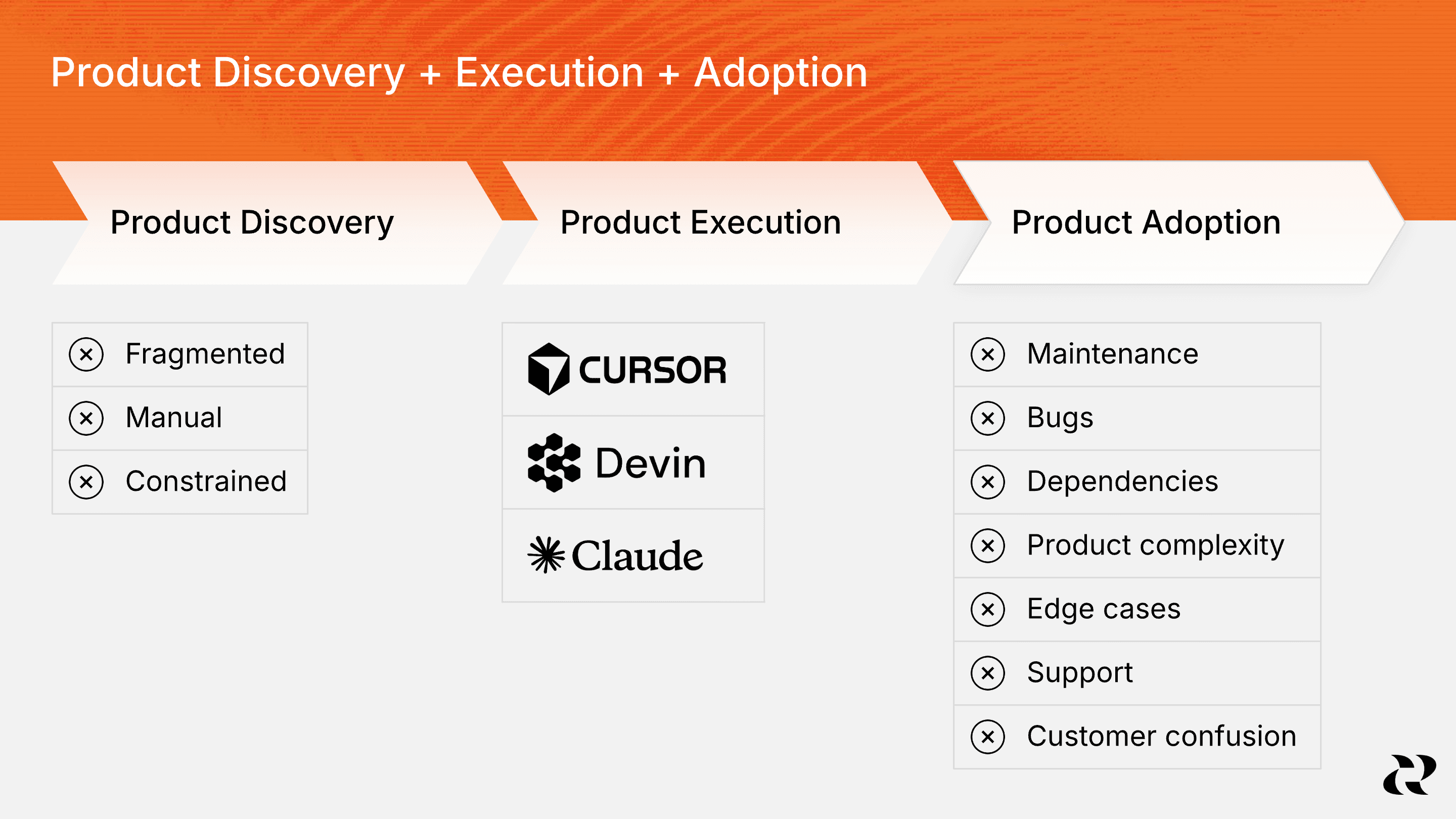
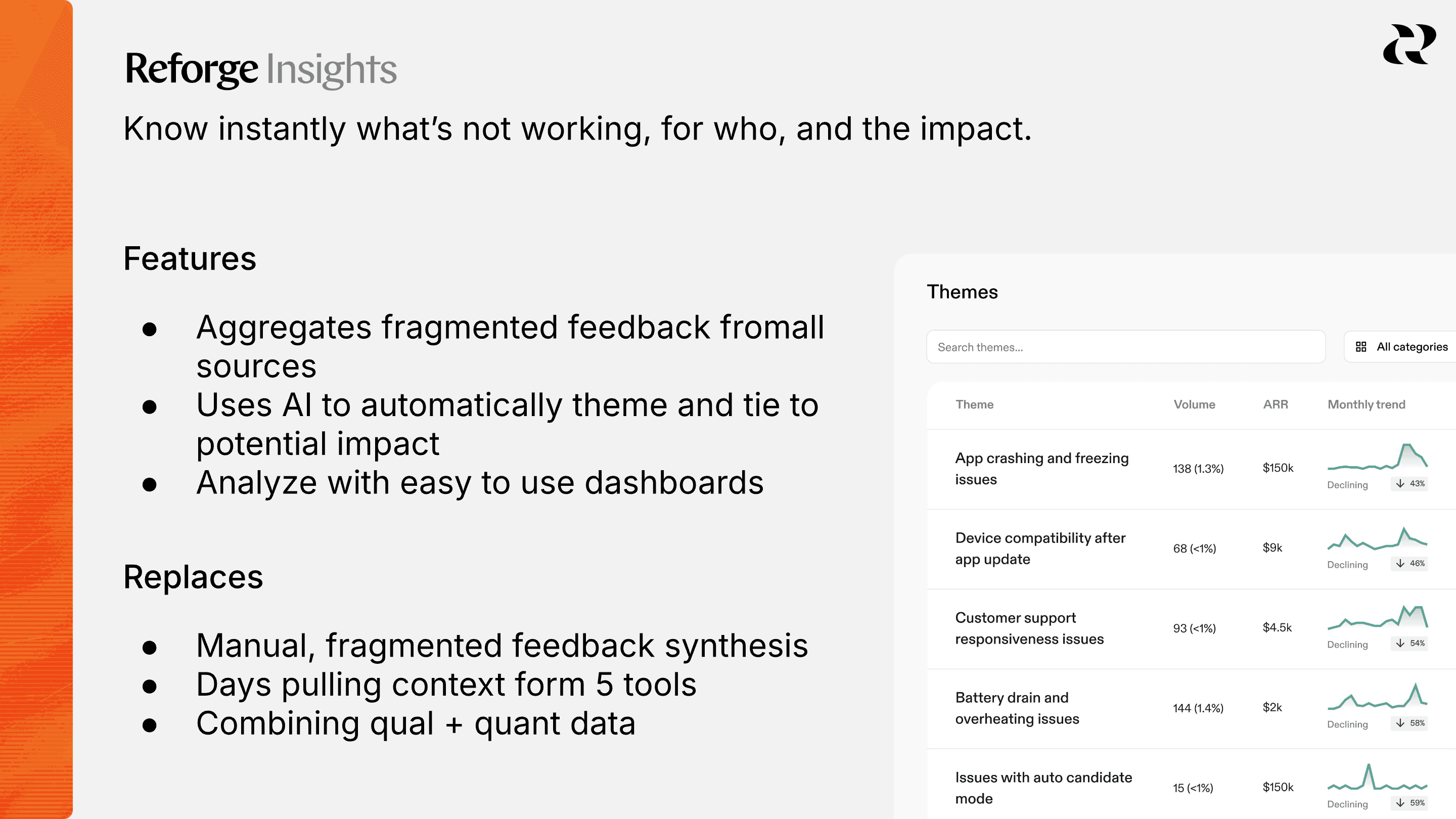
Four products. Four stories.
As Reforge broadened its offering, we needed to explain how Learning, Insights, Research, and Build fit together. Audiences overlapped, but jobs differed: education, customer & competitive analysis, user research, and 1→n prototyping. Presenting every capability at once made it harder to communicate a clear value proposition.
To present the products on the homepage, I recommended a carousel with subtle motion, direct value statements, and product imagery. Rather than giving every product equal weight at the same moment, the sequence introduced them individually within a shared visual component.
The complexity also affected Reforge’s product's entry points online. Each product had a separate sign-in and sign-up path. There was no unified identity system behind the experience. To address this constraint elegantly, I proposed and implemented a sign-in dropdown and a sign-up modal. That let us keep two CTAs in the hero instead of more.
Returning to education without starting over
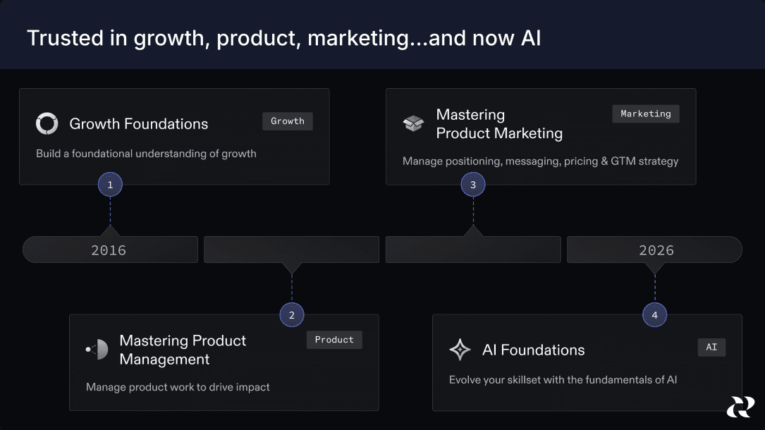
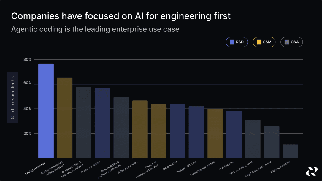
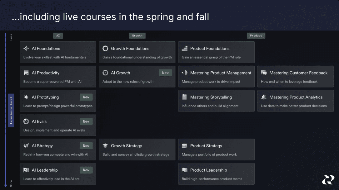
After Miro acquired Reforge in Q2 2026 and absorbed its SaaS AI capabilities, Reforge returned to being an education platform, with a focus on AI transformation, product management, and enablement.
To pivot the brand yet again, but this time more subtly, I retained the typography and underlying composition, spacing, and motion principles. I changed the color palette substantially with a dark-mode-native direction and brought back the earlier education brand’s signature blurple color. The remaining colors I reduced for simplicity, which brought the content design and brand design systems into closer alignment. This gave the brand a distinct expression while preserving continuity with the recent identity.
I also built a number of AI-assisted workflows during this transition. One moved Reforge artifacts from Sanity to Framer, where we could control what was freely visible and connect materials to author pages and related articles. This also reduced our reliance on multiple CMSs and made existing learning material easier to use in marketing. Because of this workflow, a migration that would’ve previously taken weeks, took a single day.
Conclusion
I carried Reforge’s brand through two changes in business direction, turning the identity foundations into working brand that lived across web, motion, social campaigns, and sales materials. The 2025 marketing-site implementation took two weeks; the 2026 refresh adapted that system again for a renewed focus on education.
Credits
The external agency created the initial 2025 identity foundations. I owned in-house direction, development, and execution. My cross-functional partners and stakeholders included the CEO, VP of Product, VP of Engineering, Content Marketing Lead, and the marketing, product, and sales teams. During the two-week 2025 marketing site implementation, I was assisted by one other visual designer from product.